Dec- Jan 2024


Sections are relatively complex UI components composed of groups of molecules, atoms and other sections.
These form distinct sections of an interface.
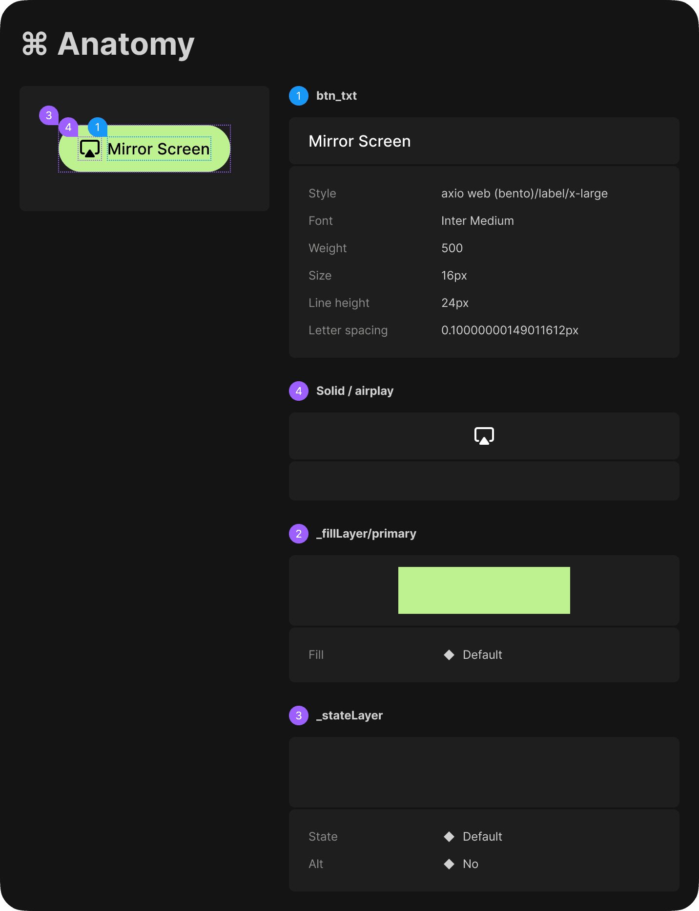
Example of how sections are defined
Atom: Text, corner radius, height, icon
Molecule: Search bar
Section: Header with search bar
Sections demonstrate those simpler components in action and serve as distinct patterns that can be used again and again
Sections
03:
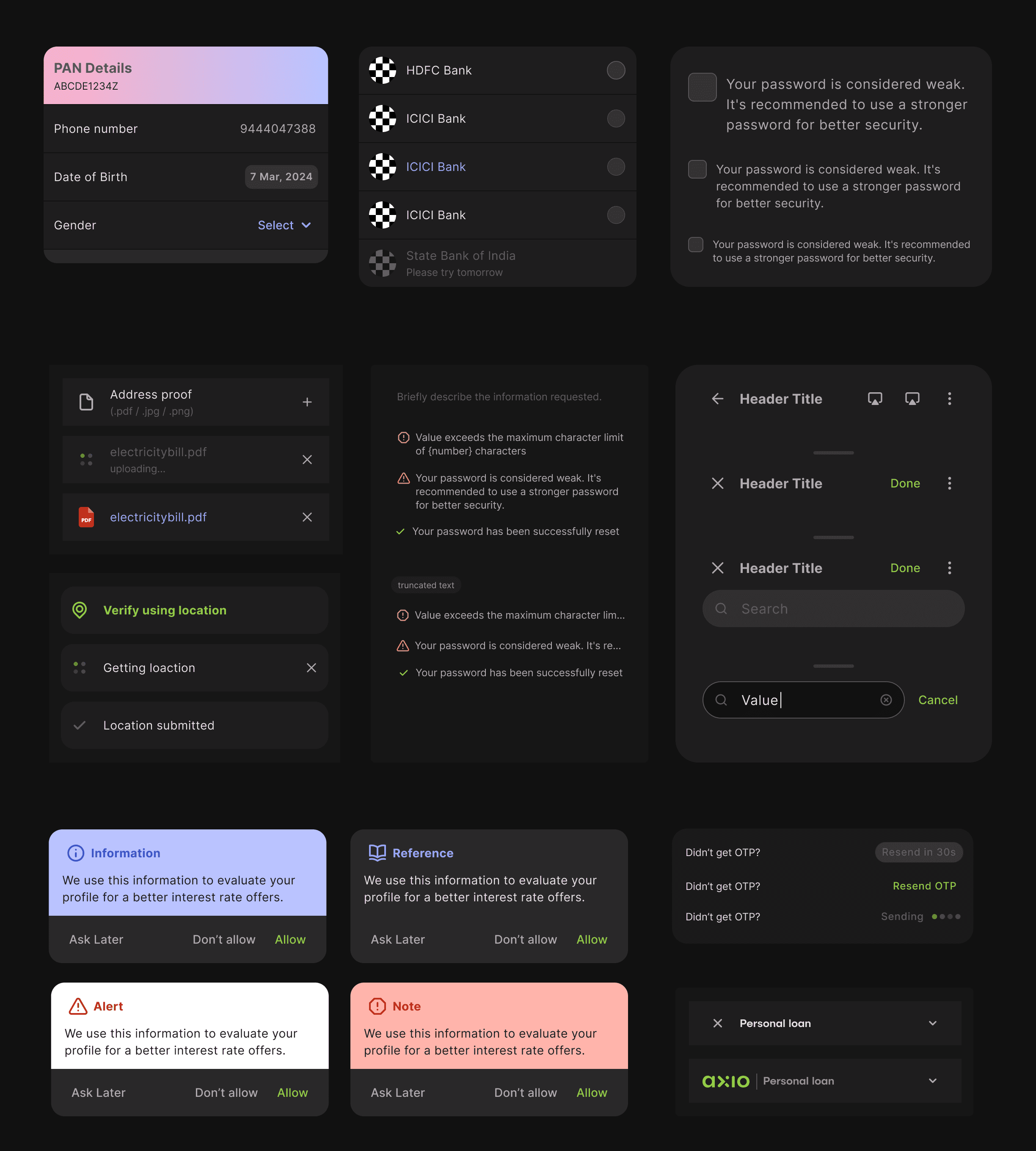
Table View
In-line loader
Status bar
Information box
File management
Subtext
Headers
Consent
Templates are page-level objects that place components into a layout and articulate the design’s underlying content structure.
Templates
04:
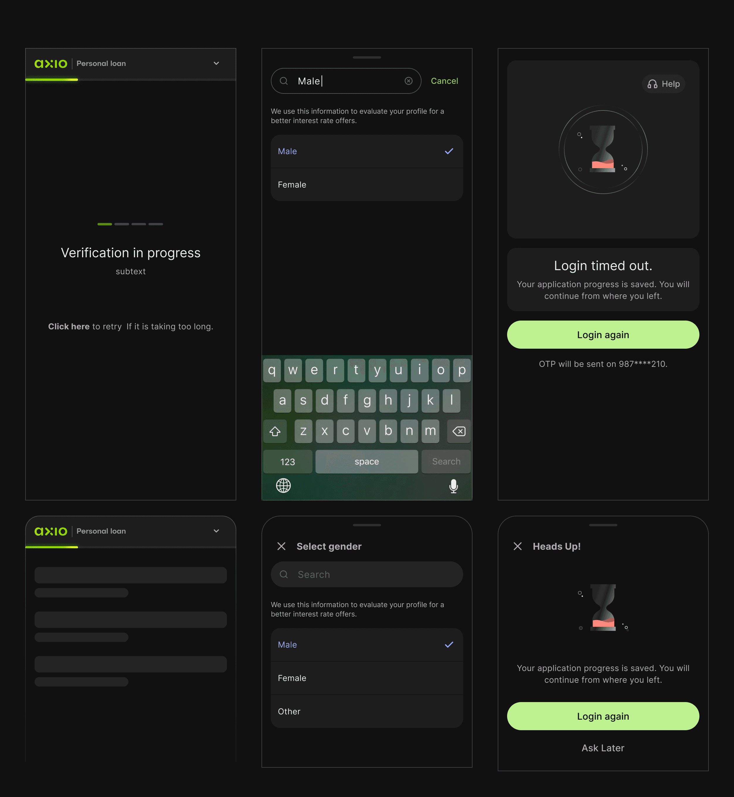
Loader
Overlay
Error screen
By defining a page’s skeleton we’re able to create a system that can account for a variety of dynamic content, all while providing needed guardrails.
Example of template: Loader screen
Header (section) + Animation (Asset) + Text (Atom) + Button (Molecule)

Annotations & DevMode
With annotations, one can quickly understand what the designer intended- a shared source of truth.
Translation of terms- Units and terms can be translated to the specific unit that the framework works in.
Ready for development- Allows developers to track edits to designs and maintain a log.
Component documentation- Usage descriptions, storybook links, and keywords.
THE COMPONENT PLAYGROUND

The superpower of playground is its ability to switch token sets for multi-brand design systems.
It removes the guesswork from how to make the component flexible and simplifies the creation of component APIs.
Bento Design System in action
Personal loan sign up journey


Learnings & Outcomes
Status: To be implemented
Preparation Pays Off: It requires upfront investment in time and resources, however, planning the structure at the beginning is crucial to the system.
Don't fret over perfection: As designers we may strive for perfection, but when establishing a system of this scale, getting the guardrails in place is priority.
Collaboration Enhances Outcomes: Having a back and forth between developer and designer is key for ensuring that the system is adaptable to various contexts.
Compounded Pay-off- As more designs come into the fold of the system, the system becomes more robust, reducing TAT of deliverables.