Personal loan: Building
an offer screen
Analyse and re-design the UX of the EMI offer screen to improve transparency and reduce drop-off’s.

Sept- Dec 2023


Narasimman Rajendran
Design Lead
Project Contributors

Apoorva Maheshwari
Product Manager

Me
Product Designer
My role
Conducting surveys, documenting feedback, funnel analysis,
Overview 👀
Nearly 70% of Indian travellers who use pay later options for their vacations are more likely to splurge on indulgent experiences.
As a dominant player in the travel space, Make My Trip partnered with Axio to provide an easy to use pay later checkout option- TripMoney.
What are we solving for?
The analysis of the transaction flow funnel using Axio as a pay later checkout option indicated that most drop-offs happen at the EMI options screen, pointing to usability issues.
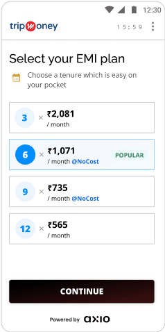
Current EMI selection
EMI screen is number heavy and confusing. How do users consume this data with ease?
What information is vital for the user to make an informed decision on which EMI is best for their purchase?
Key Facts Statement (KFS) and processing fee (PF) must be shown to the user with minimal visual invasion.

key facts statement

UI as per Trip Money’s old branding
Encouraging users to make aware and mindful choices by being transparent with details like downpayment and processing fee
Processing numerical data can be a cognitive load, presenting this in a logical format (like a bill) would be easier to process

Users can focus on the choices that matter to them by only viewing the tenures that they are eligible for
TripMoney branding has been refreshed to align with the Make My Trip branding. The UI must reflect this change.
The
Insights
Current EMI selection
EMI screen is number heavy and confusing. How do users consume this data with ease?
What information is vital for the user to make an informed decision on which EMI is best for their purchase?
Key Facts Statement (KFS) and processing fee (PF) must be shown to the user with minimal visual invasion.
key facts statement
UI as per Trip Money’s old branding
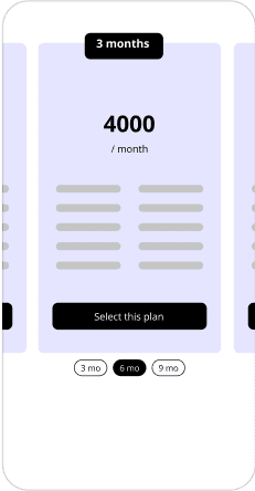
A few approaches
Pros
All tenures are displayed in one view, making it easy to compare options.
Cons
All details of the EMI like downpayment, total payable by EMI and processing fee are not upfront
Expansion of the option to view details is not clear
Additional click needed to view details of each option.
Pros
All details are visible upfront and in a logical order, making it easier for users to do their EMI calculations.
Swipe actions creates an easy browsing experience.
Cons
Carousel action may require learning curve.

The final design
What information does the user require to choose the right financing option ?
EMI amount
Downpayment
Processing fee
Interest rate
Number of installments
Key Facts Statement
Future bets
The 'under-writing process'
MMT targets its ‘good customers’ by monitoring their spending and payment patterns. They are then nudged at checkout to avail the travel credit service.
How is this product discovered?
Future bets
Improving waiting screen micro-interaction to keep the user engaged.
Dropping OTP based verification for swift transaction completion
(user is verified as an MMT user)